
Little Box, Big Moments

Crafted cucina

Chaos contained

Reducing waste in good taste

The art of less

Tools with Taste
From Sealed Tight to Styled Right
Click Clack had made its name in food storage, but they were ready for more. To expand into kitchen gadgets, they needed a range that felt elevated, distinctive, and ready to compete with category leaders.
That’s where Alquemy came in.
Our challenge? Design, develop, and deliver a standout collection fast! In just six months, we brought strategy, style, and precision to the table, helping Click Clack debut a bold new product category.

Standing Out by Fitting In
In a category overrun with lookalike tools, the Click Clack gadget range was designed to break from the noise, without breaking the harmony of a modern kitchen.
The challenge was two-fold: stand out on a crowded retail shelf, but settle in beautifully on a benchtop at home. We developed a visual brand language that was elevated yet understated, feminine without being frivolous & refined without being sterile. Each gadget carries its own personality, but together, they hum in unison. Unified proportions, subtle curves and a signature die-cast end cap tie the collection together with quiet confidence.


"Phil and Dave were incredible partners on the ClickClack Gadgets project, bringing 23 SKUs from sketch to T1 sample in just six months. Their deep manufacturing knowledge, design excellence, and seamless collaboration helped us create award-winning, mass-producible products that are as beautiful as they are functional."
KELLY WEST /// MARKETING MANAGER, CLICK CLACK
Premium, Without the Price Tag
Plastic kitchen tools are often dismissed as cheap and cheerful. We saw an opportunity to rewrite that story. By combining common materials like nylon with considered surfacing and detailing, we delivered tools that look and feel far beyond their cost. The tactile matte finish contrasts with polished accents, while the decorative metal end cap adds a luxe touchpoint that catches both light and attention.
It’s proof that with the right design moves, even the most modest material palette can punch well above its weight.


Minimal Moulds, Maximum Impact
Creating a full gadget range usually means ballooning tooling costs. We flipped that script. By cleverly engineering just two handle sizes and pairing them with a variety of functional heads, we enabled Click Clack to offer a comprehensive product lineup without blowing the budget.
Each gadget is sculpted to look purpose-built and unique thanks to subtle form transitions and surface resolution tricks that visually separate the handle from the head. The result: a broad range that feels richly detailed, not cookie-cutter.
Weighted Right. Styled Tight.
Form. Function. Flair.
At first glance, the polished die-cast end cap is a simple styling flourish. Look closer, and it’s doing a lot more. It creates a consistent design signature across the collection, reinforces brand recognition, and injects a hint of shine into an otherwise matte toolkit.
But it’s not just for show. The cap doubles as a hanging hook, making each tool easy to store. Even better, its added weight shifts the balance of the gadget toward the hand, improving ergonomics and giving each tool a surprisingly premium in-hand feel.


Six Months. Zero Compromises.
Designing a full kitchen tool range is no small feat. Doing it in under six months? That takes precision and grit. From early concepting to final production sign-off, we ran a lean but meticulous process, compressing development timelines without compromising quality.
The range made its debut at the Chicago Home + Housewares Show to strong reception, and helped Click Clack stake its claim in the broader homewares market. A fast, focused sprint that delivered lasting brand value.


Related Projects
IFIXIT ///
COMMON TIGER ///
Explore more work

Precision, hand delivered

The art of the pivot
The Business Case for Cohesion
Dorel’s Safety 1st Infant Health portfolio had a problem hiding in plain sight. The products were aging, and each spoke in its own voice, so the line didn’t read as one family. With key big box retailers watching closely, Dorel needed a fresh point of view and a faster way to earn their confidence.
In a compressed timeline, we defined a new VBL to unify the range. Retailers embraced it, and that momentum became the mandate to carry it through every product.
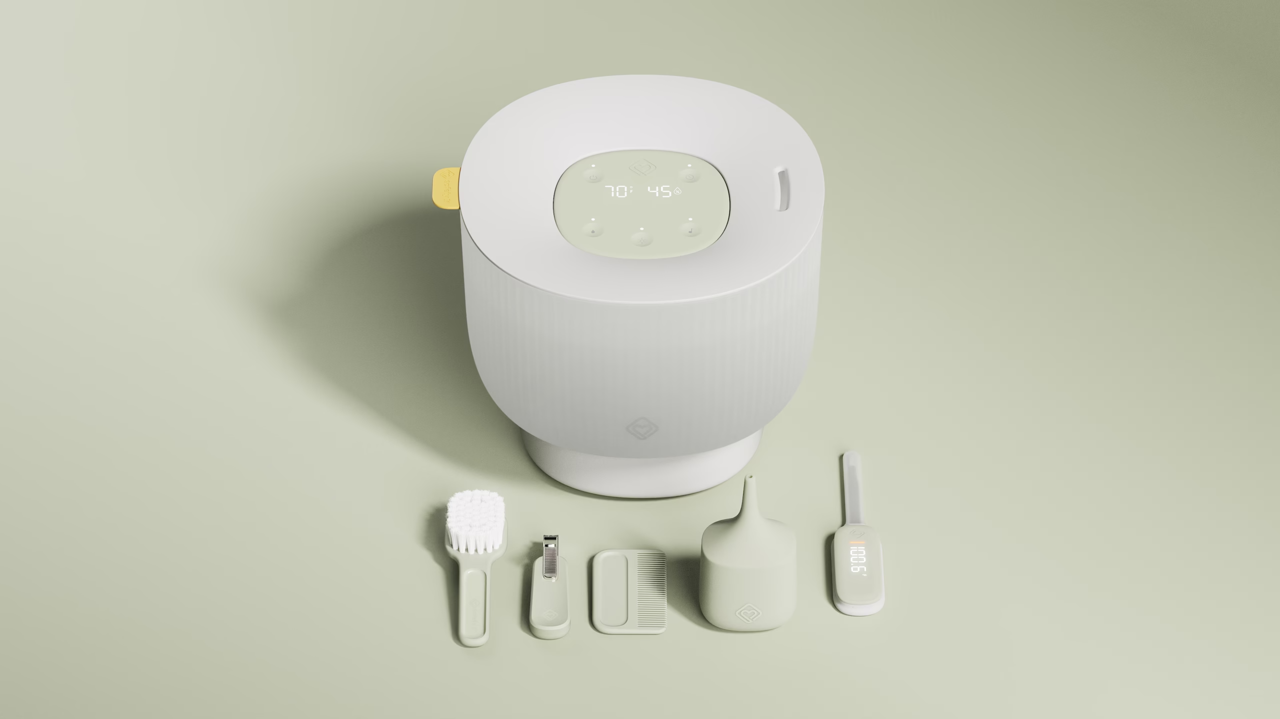
Designed for parents, by parents, for the home.
Drawing on our expertise in the home, and on our own experience as parents, we defined a language that feels soft, intuitive, and confident. We designed for the parent and the designer at once, asking what we’d want in our own homes, and what we’d reach for at 3 a.m.
Conversations with key stakeholders revealed a clear appetite to evolve Safety 1st toward wellness in the home. From those insights, we focused on three moves: forms that echo the housewares families already live with, calm colors and finishes that quiet the visual noise, and deadfront interfaces that guide interaction gently instead of competing for attention.

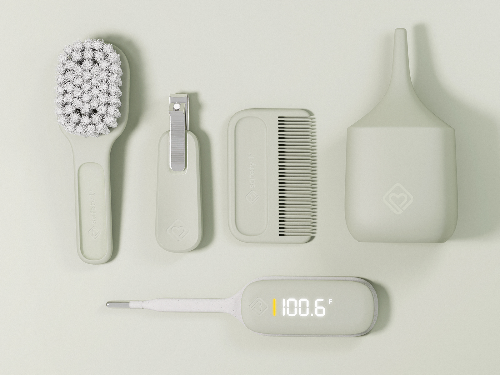
Intuitive In The Hand, In The Home and at 3am.
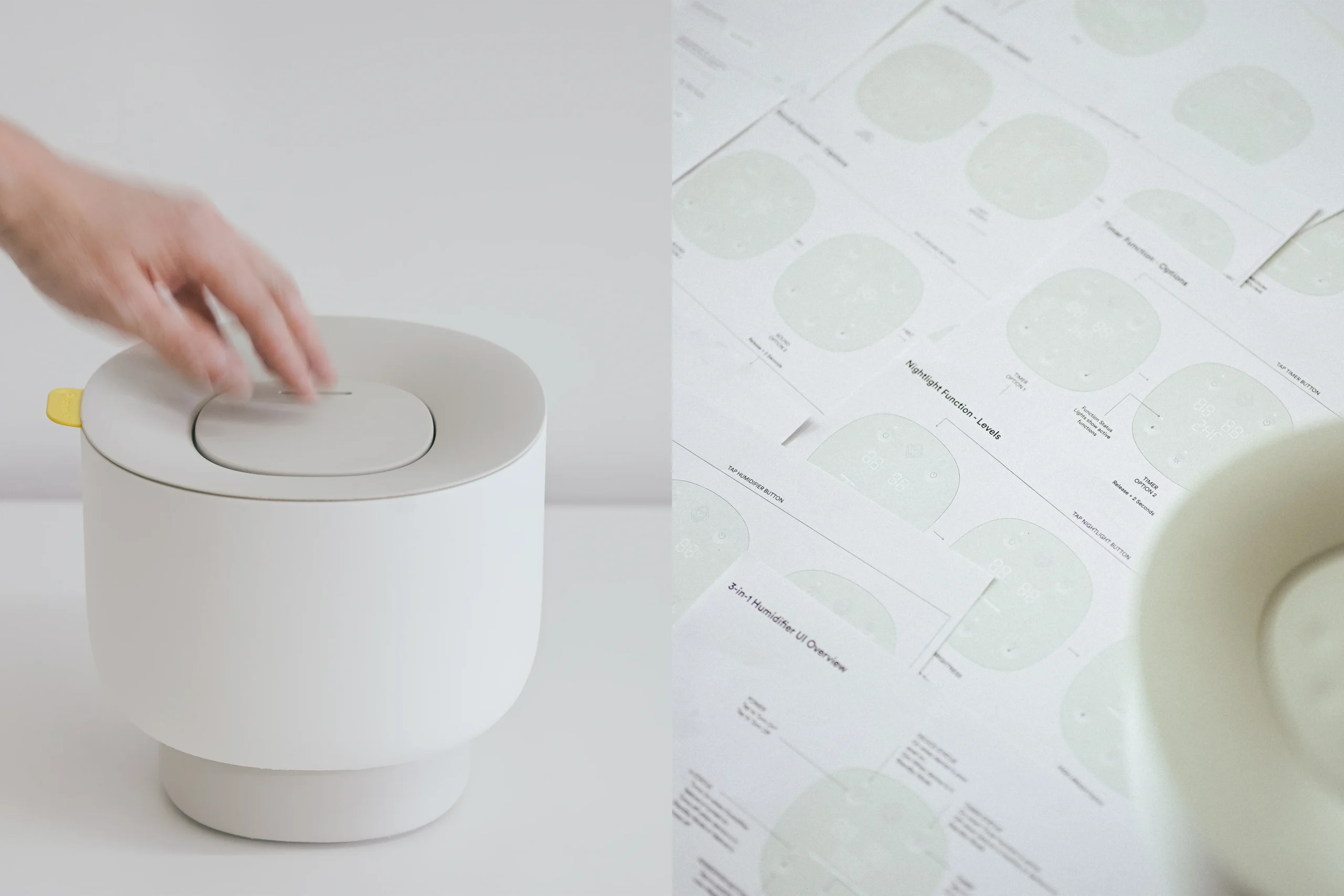
Through countless mockups and iterations, we developed a line of products that removes the barriers between a device and the outcome a parent is after. Scale models let us study form, proportion, and ergonomics hands-on, and see how each product feels in the home, not just how it looks on a screen.
The interface follows the same principle. It is discreet yet feature-rich, guiding the user calmly when on and disappearing entirely when off.
Quiet reassurance
At the center of the language is an idea we called Quiet Reassurance: helping and guiding the parent without being loud.
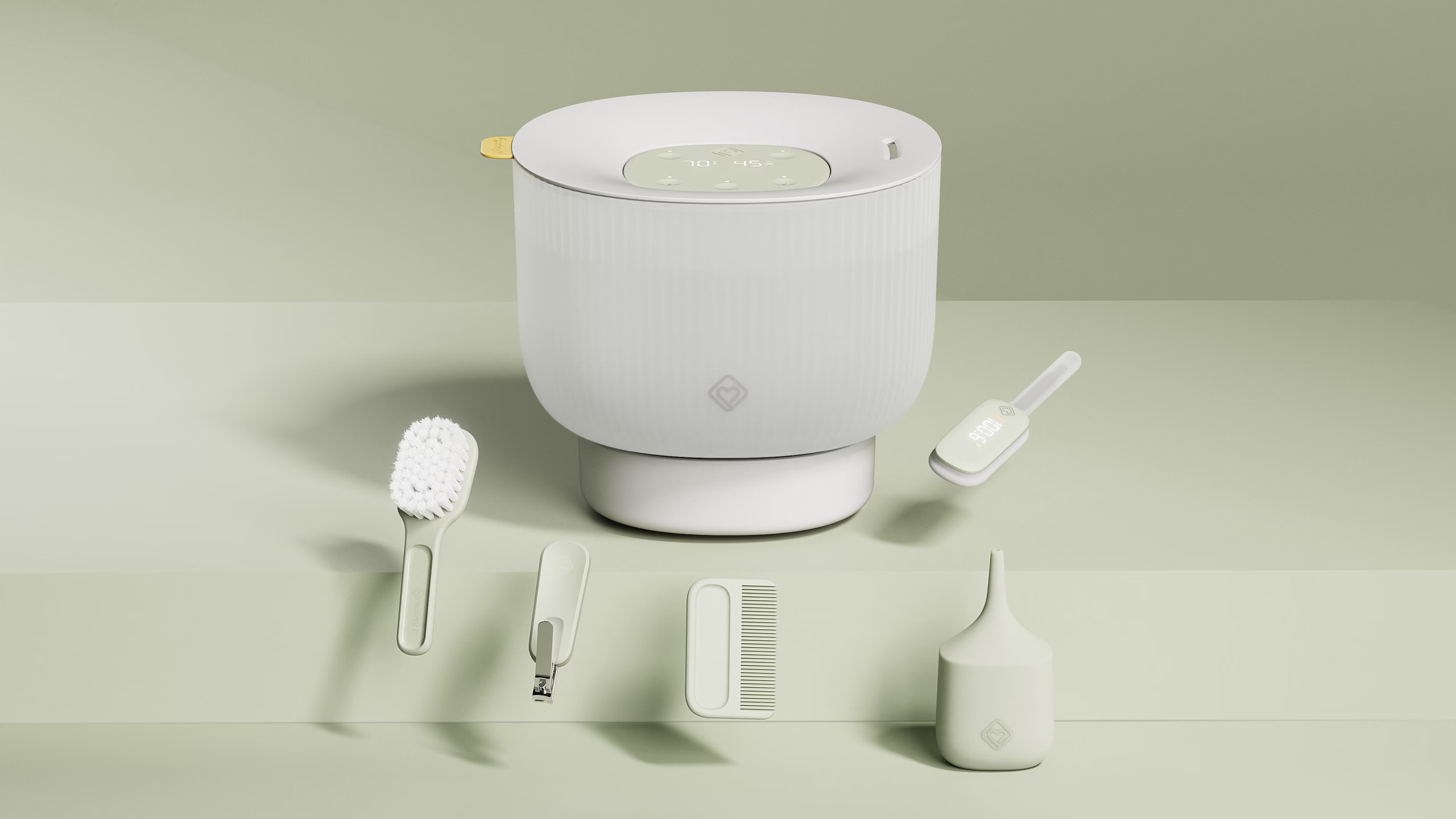
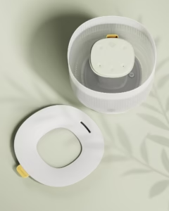
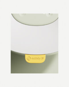
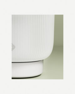
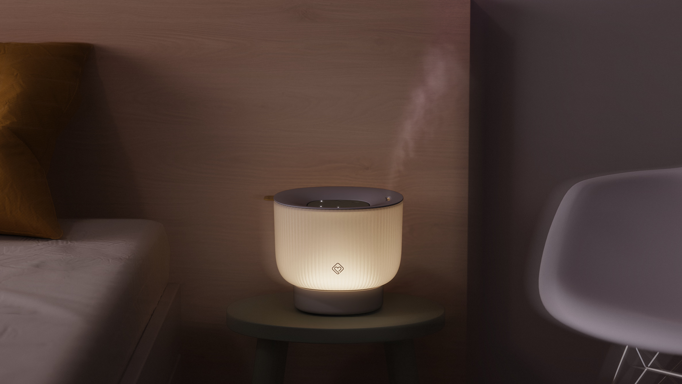
The humidifier shows it best. Soft recesses in the interface guide your hand in the dark, while reducing seams and making cleaning easier. Backlit LEDs appear only when needed, cutting visual clutter and mental load. A bright pop of color in the lid acts as both an affordance and a key branding element.
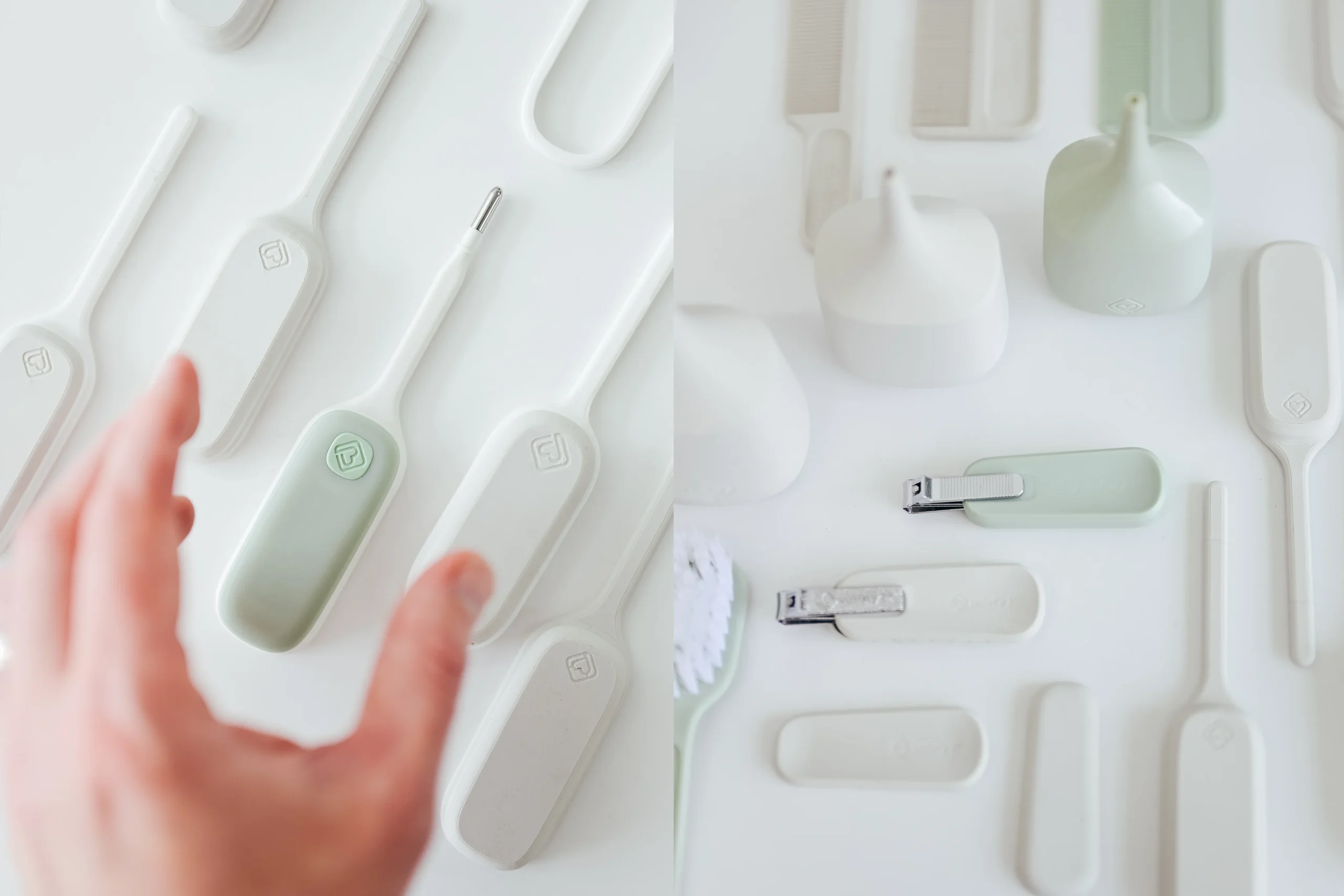
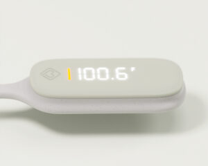
The same approach carries across the line, from the thermometer’s deadfront interface to the dished surfaces throughout the baby basics products.
Small Price. Big Thinking.
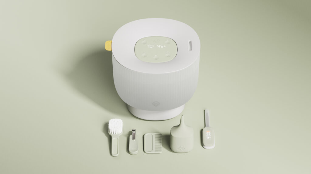
At big box retail, cost is always the guiding factor. For the Baby Basics line, a kit of brush, comb, nail clippers, and nasal aspirator found at Walmart, the challenge became clear: how do we bring good design and added value without moving the price even a penny?
The answer was in the details that cost nothing to change. An elevated color palette, soft form language, and intuitive forms brought new life to an otherwise basic offering, helping everyday essentials feel considered, and stand out on a crowded shelf.
"Alquemy was an integral part of our team from day one. They worked hand in hand with our engineers from ideation through design, supported the transition into tooling and manufacturing, and helped us fine-tune every detail for production. Their entire team brought professionalism and insight at every stage, and they genuinely opened our horizons on what's possible in this category."
Michael Vescio // Senior Category Manager // Dorel Juvenile