Quiet reassurance
SAFETY 1ST ///
The Business Case for Cohesion
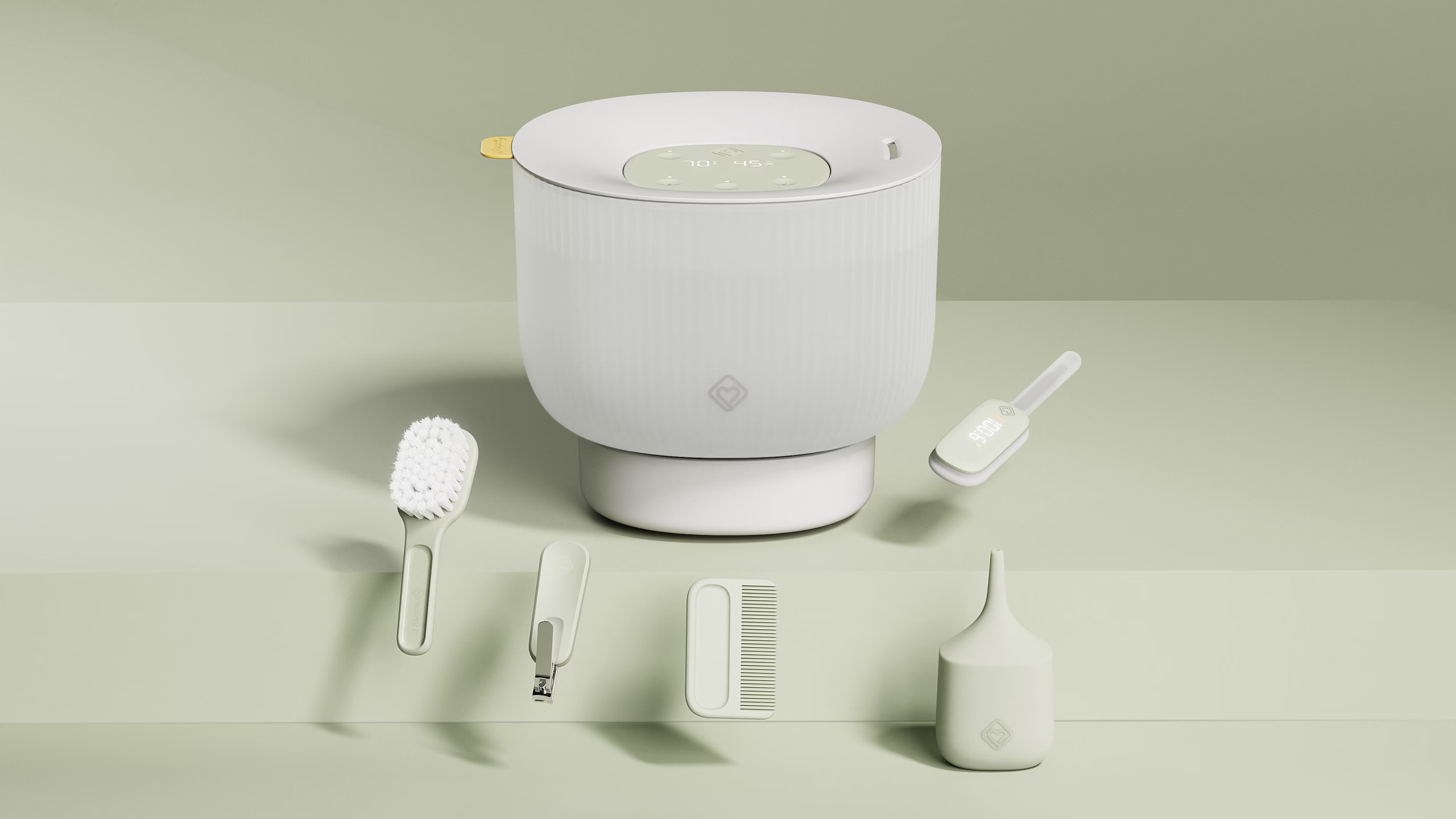
Dorel’s Safety 1st Infant Health portfolio had a problem hiding in plain sight. The products were aging, and each spoke in its own voice, so the line didn’t read as one family. With key big box retailers watching closely, Dorel needed a fresh point of view and a faster way to earn their confidence.
In a compressed timeline, we defined a new VBL to unify the range. Retailers embraced it, and that momentum became the mandate to carry it through every product.
Designed for parents, by parents, for the home.
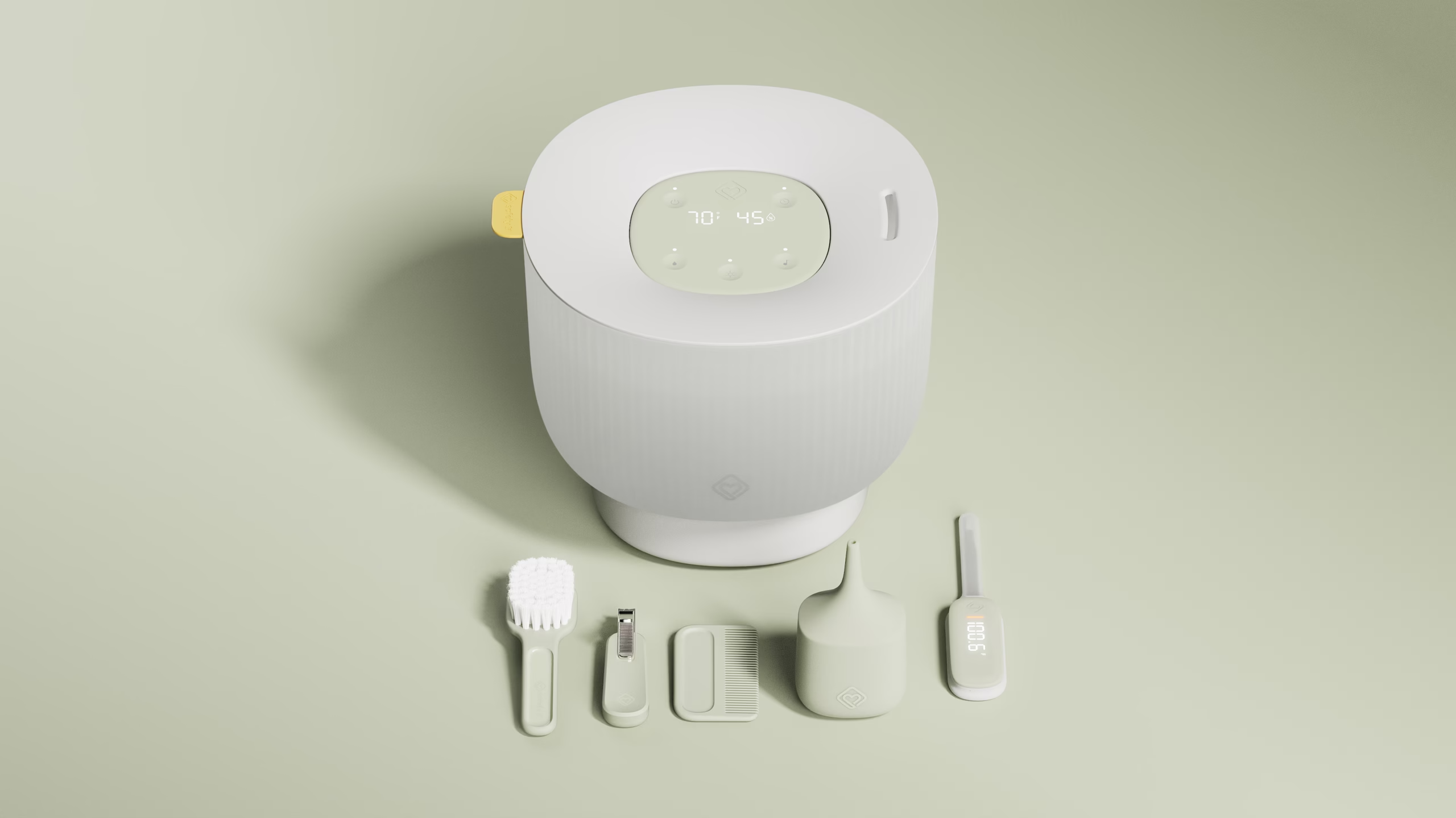
Drawing on our expertise in the home, and on our own experience as parents, we defined a language that feels soft, intuitive, and confident. We designed for the parent and the designer at once, asking what we’d want in our own homes, and what we’d reach for at 3 a.m.
Conversations with key stakeholders revealed a clear appetite to evolve Safety 1st toward wellness in the home. From those insights, we focused on three moves: forms that echo the housewares families already live with, calm colors and finishes that quiet the visual noise, and deadfront interfaces that guide interaction gently instead of competing for attention.
Intuitive In The Hand, In The Home and at 3am.
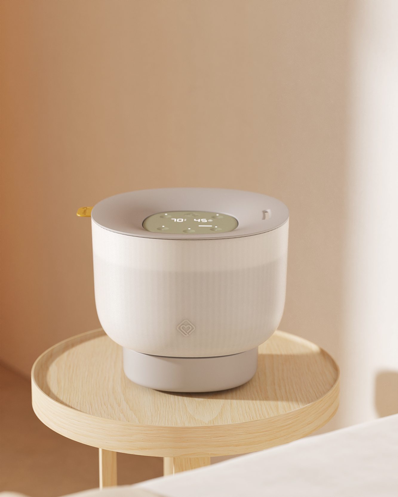
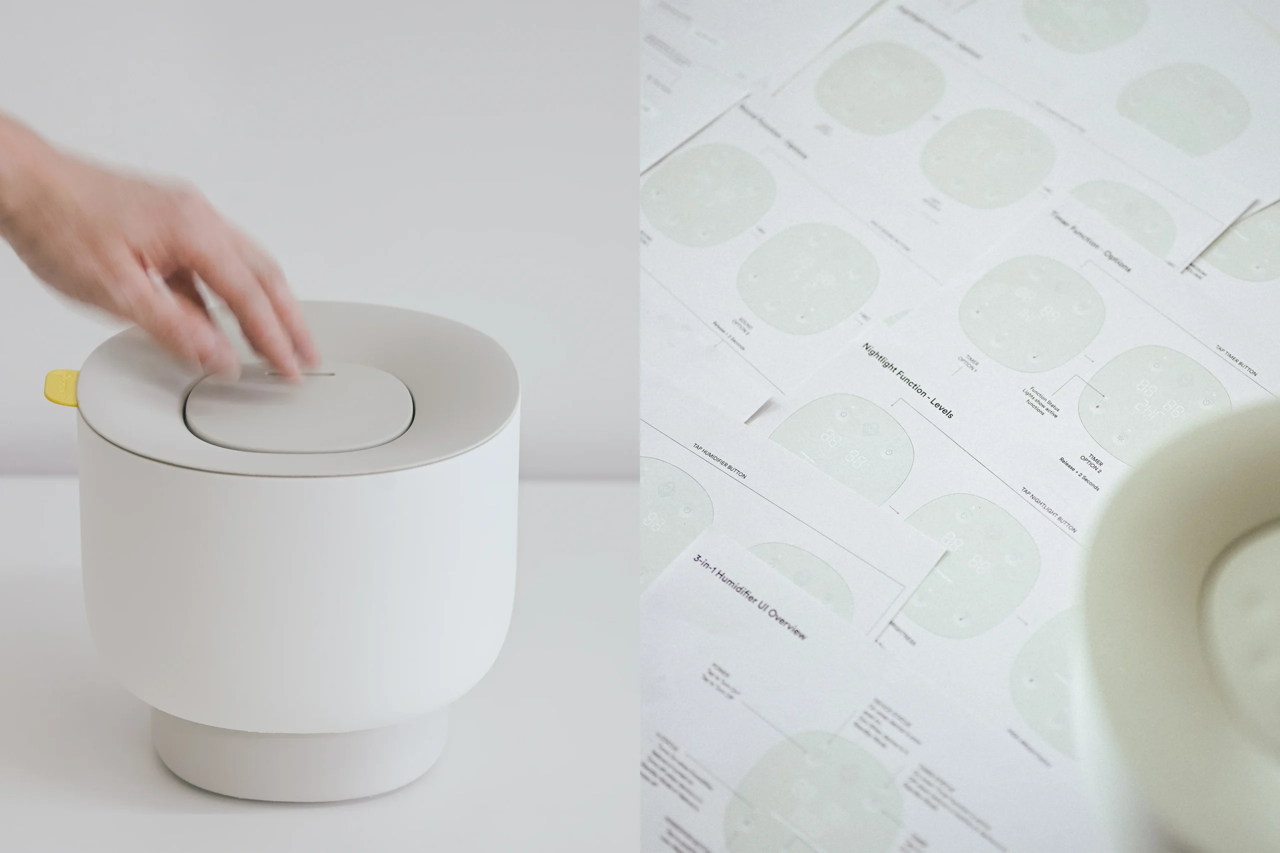
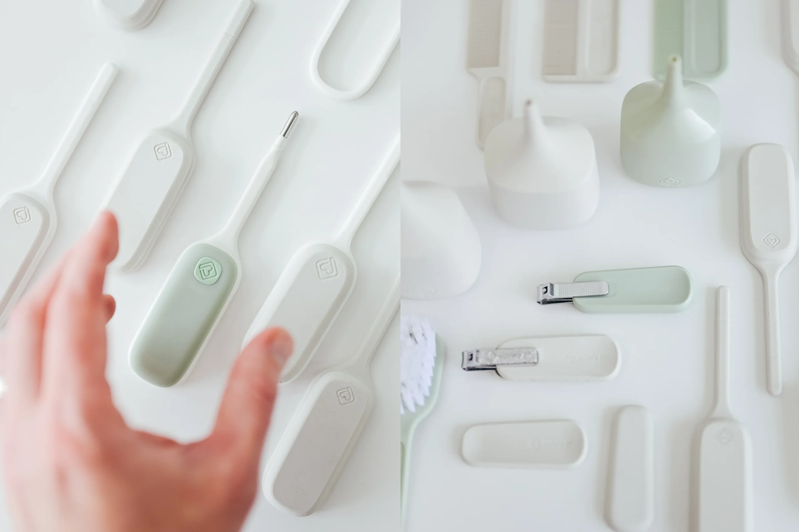
Through countless mockups and iterations, we developed a line of products that removes the barriers between a device and the outcome a parent is after. Scale models let us study form, proportion, and ergonomics hands-on, and see how each product feels in the home, not just how it looks on a screen.
The interface follows the same principle. It is discreet yet feature-rich, guiding the user calmly when on and disappearing entirely when off.
Quiet reassurance
At the center of the language is an idea we called Quiet Reassurance: helping and guiding the parent without being loud.
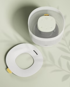
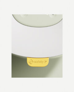
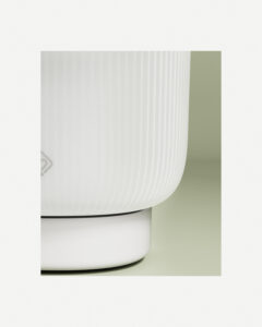
The humidifier shows it best. Soft recesses in the interface guide your hand in the dark, while reducing seams and making cleaning easier. Backlit LEDs appear only when needed, cutting visual clutter and mental load. A bright pop of color in the lid acts as both an affordance and a key branding element.
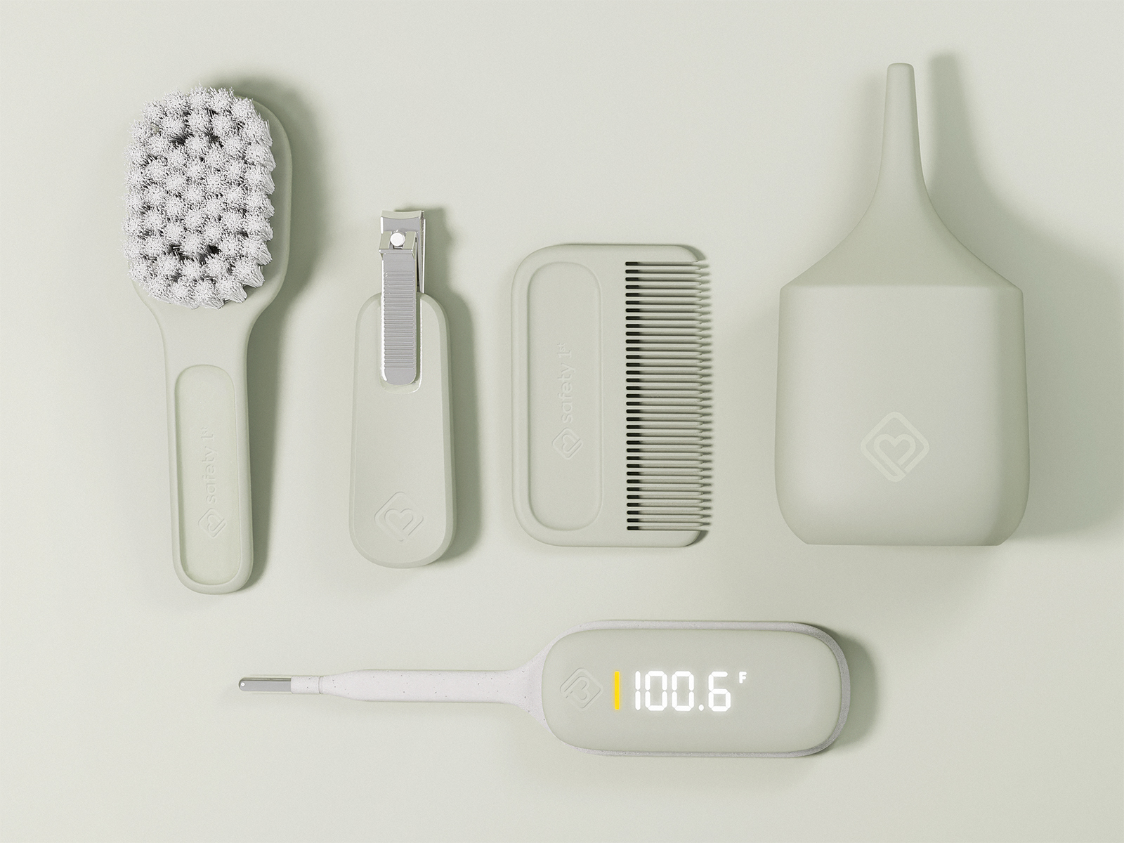
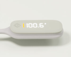
The same approach carries across the line, from the thermometer’s deadfront interface to the dished surfaces throughout the baby basics products.
Elevated Design, Accessible to the Masses.
At big box retail, cost is always the guiding factor. For the Baby Basics line, a kit of brush, comb, nail clippers, and nasal aspirator found at Walmart, the challenge became clear: how do we bring good design and added value without moving the price even a penny?
The answer was in the details that cost nothing to change. An elevated color palette, soft form language, and intuitive forms brought new life to an otherwise basic offering, helping everyday essentials feel considered, and stand out on a crowded shelf.