The art of less
KOR WATER
Inspired by Picasso. Refined for real life.
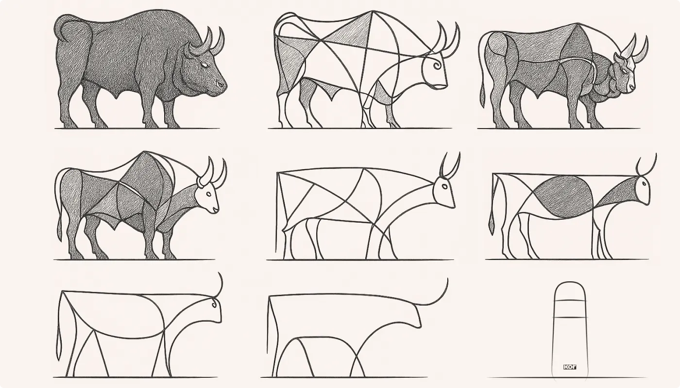
Our design strategy for the Melrose collection started with a bull. Or more specifically, a series of them – Picasso’s famous study in reduction, The Bull, which strips form down to essence, one line at a time.
That was our brief: distil the modern water bottle to its purest elements. No excess, no noise – while still delivering a beautiful, tactile drinking experience. Simplicity, not as style, but as substance.
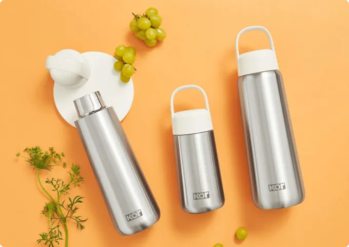
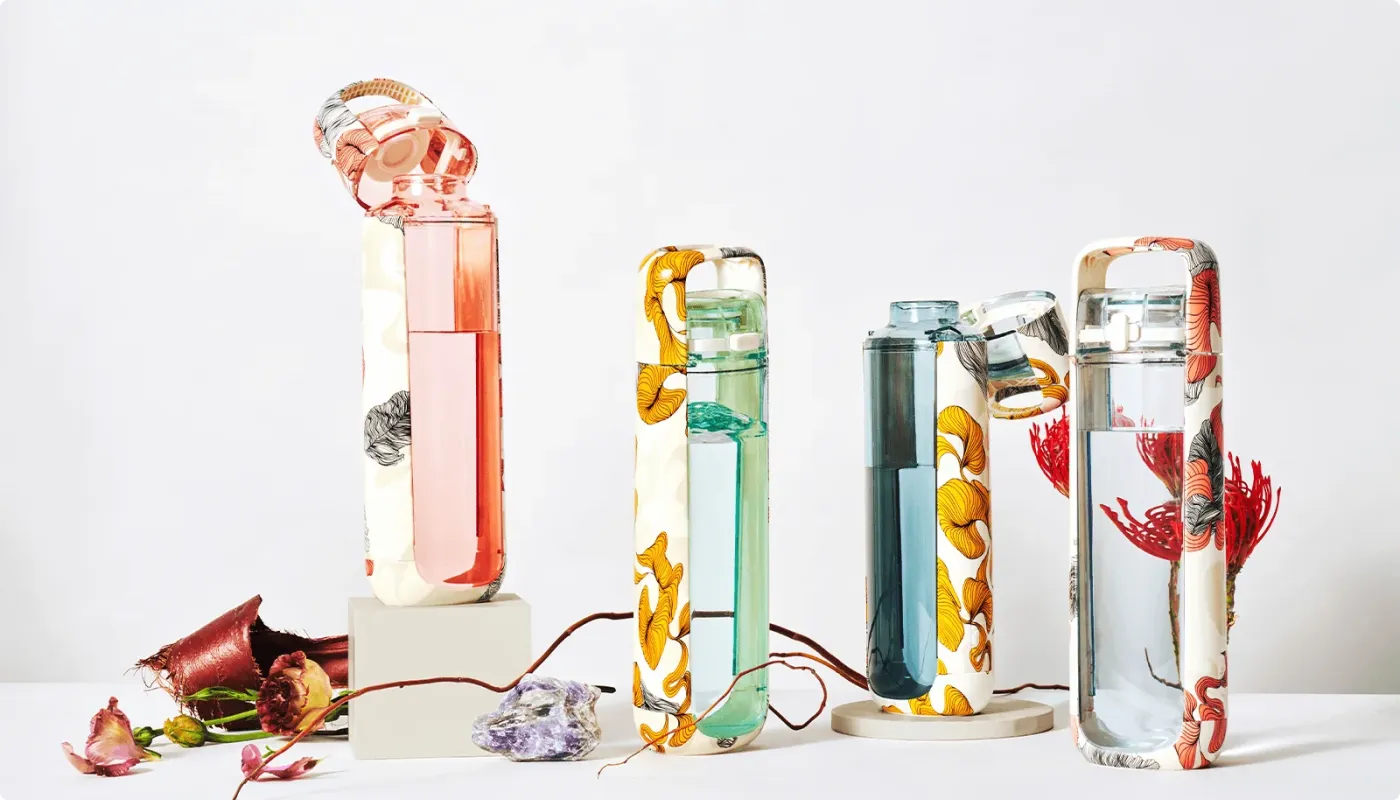
The little black bottle
Understated. Elevated. Always Ready.
Melrose is hydration’s answer to the little black dress – versatile, timeless, and designed to work wherever you go. From yoga class to client meetings to date night, this collection slips seamlessly into every part of your day. Nothing loud, nothing over designed – just confident, quiet utility with style to match.
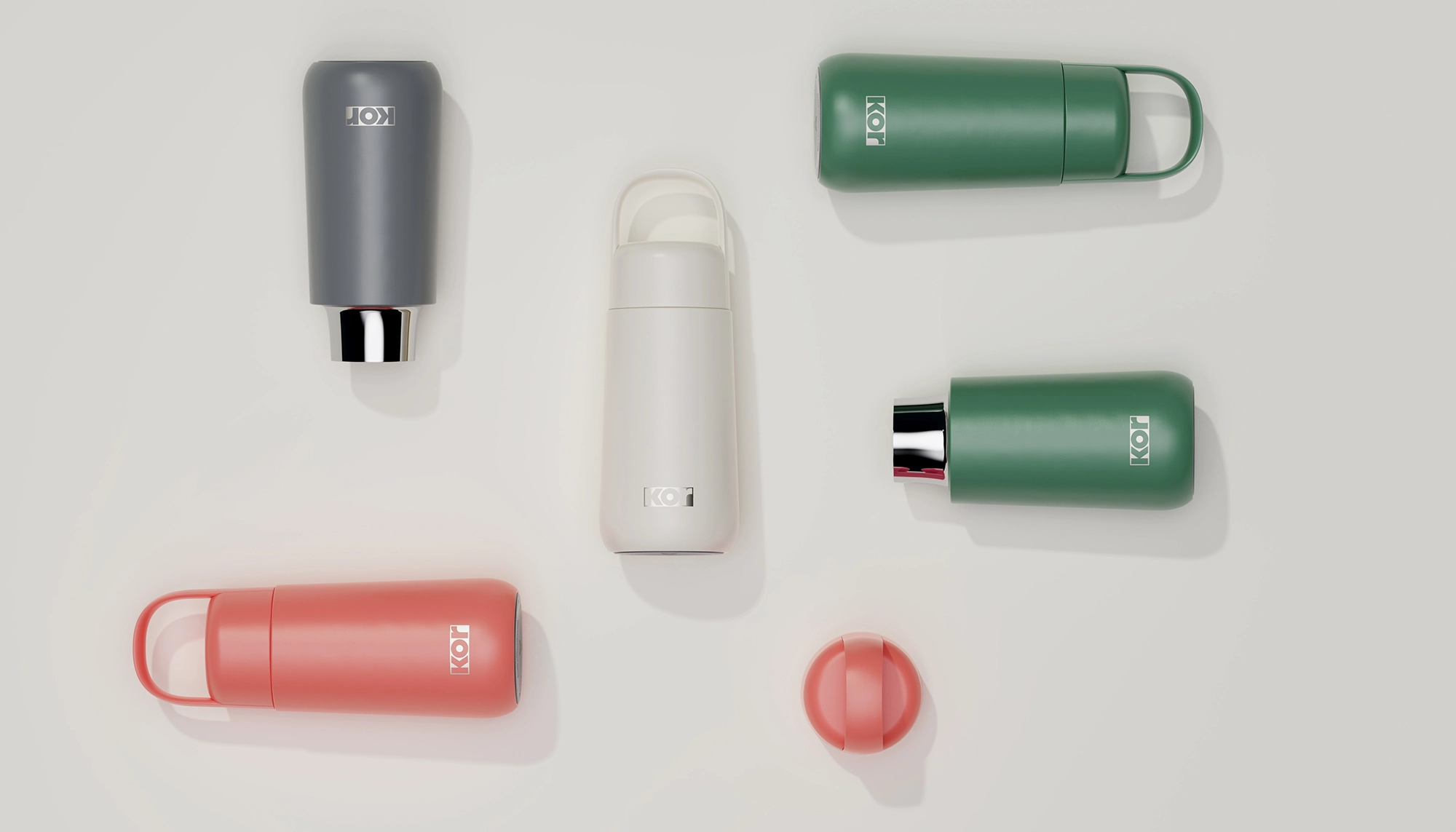
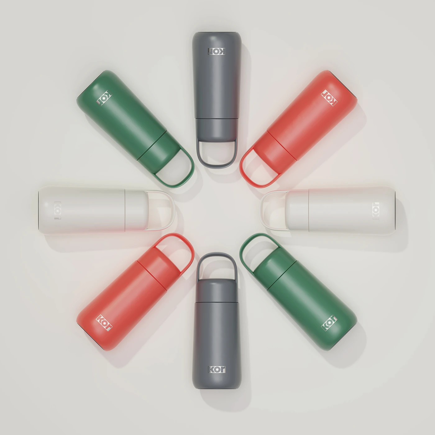
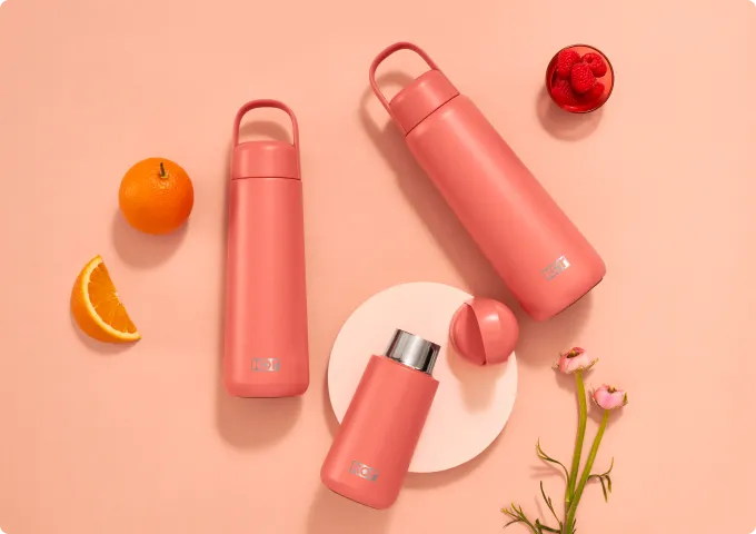
Modularity, mastered
We designed Melrose as a system, not just a series.
Interchangeable handles in solid colours, translucents and even elevated metal. Glass and stainless steel body options. A single lid architecture built to support them all.
The result? A customisable hydration experience that feels tailored without being complicated. Effortlessly modular, intentionally minimal.
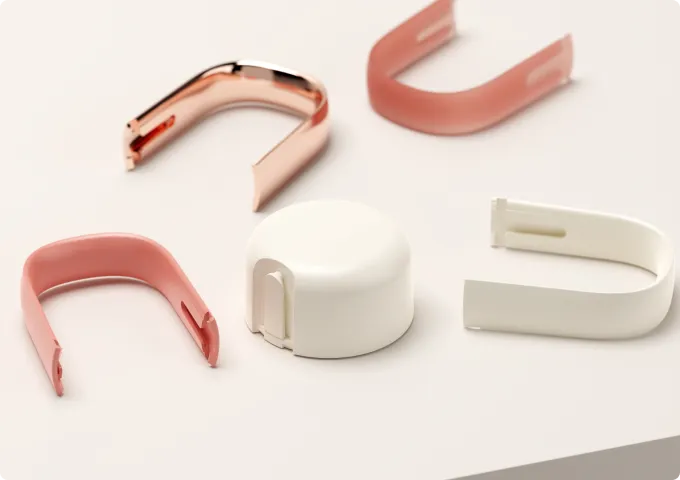
Beauty that had to be earned
Getting that clean, minimal silhouette to function across materials and formats wasn’t just design – it was engineering. We rethought the lid architecture from the inside out to make the whole system work: leak-proof, satisfying to use, and seamless to assemble.
Behind the soft curves is some seriously hard problem-solving.
From chaos to cohesion
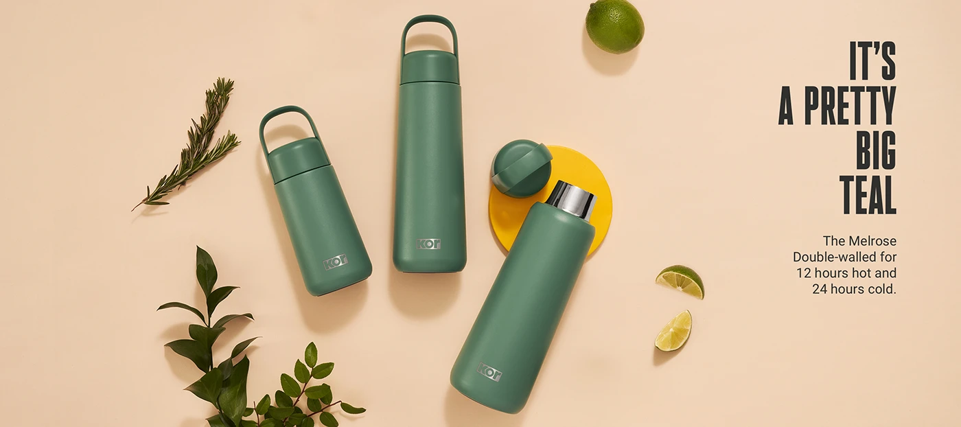
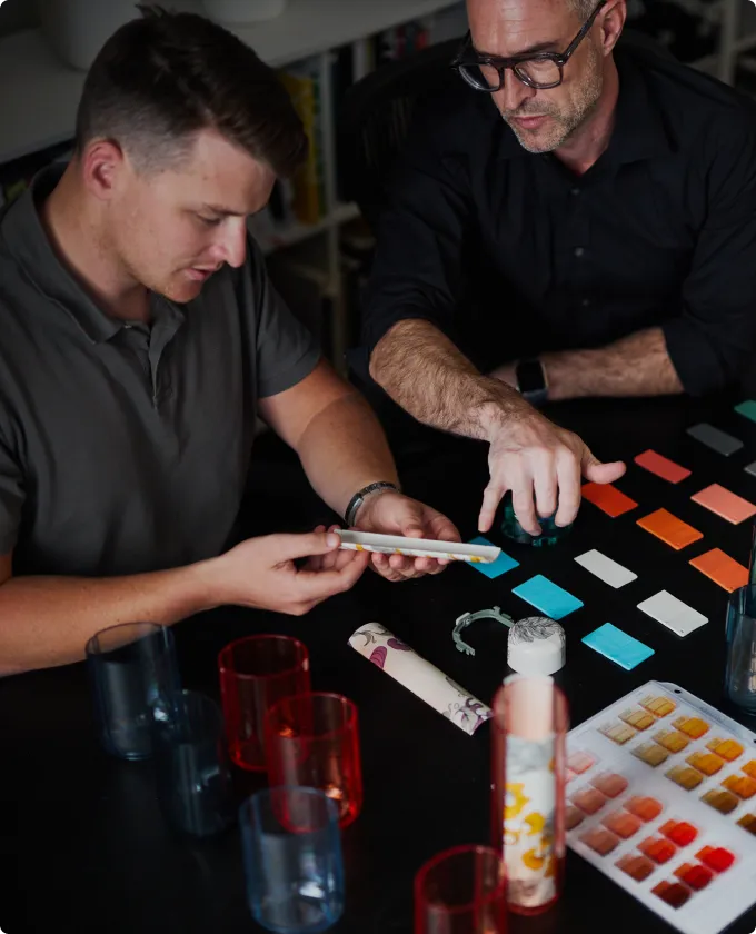
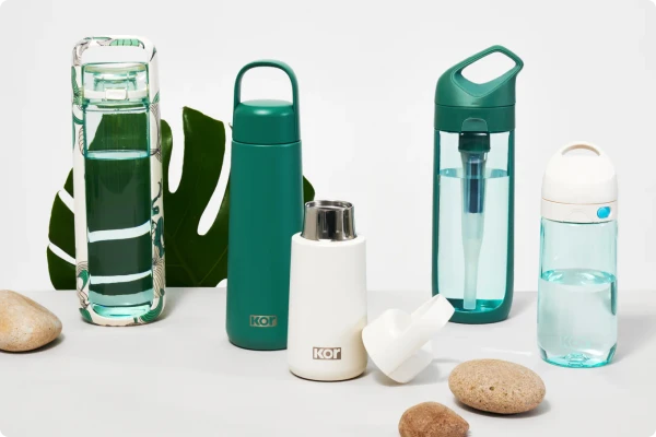
Alongside the product, we helped craft a refreshed colour palette that unified the broader KOR range.
Melrose became the anchor – setting a tone that was elevated, restrained, and unmistakably modern. The result was more than a new product. It was a visual reset for the entire brand.
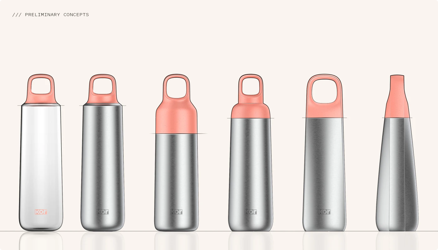
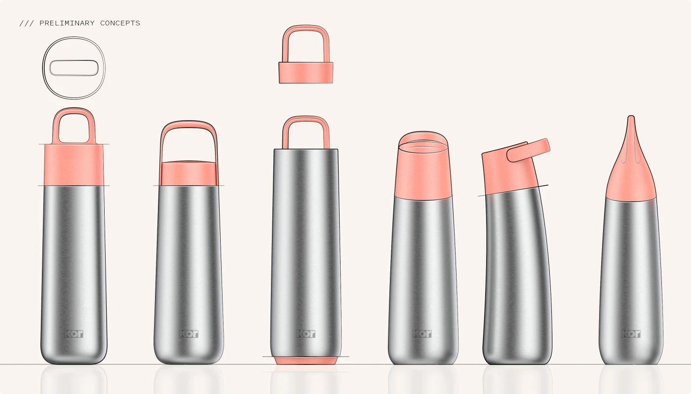
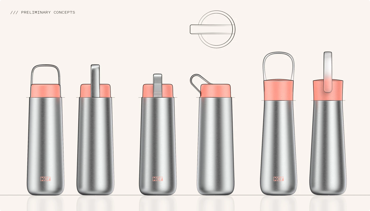
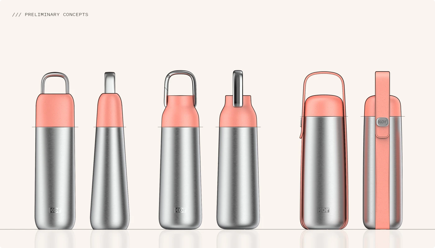
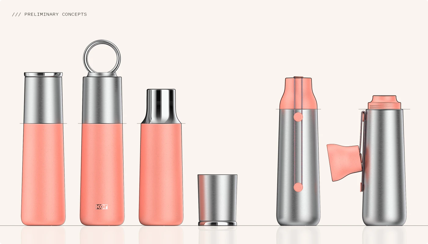
Heritage Rewritten
Before sketching, we decoded the KOR design language. We softened the performance cues and introduced a more refined, fashion-forward aesthetic. Our early concept work set the tone for a new era – one that honoured KOR’s expressive roots while evolving it into something sleeker & more elevated.
These early studies also explored a modular system of interchangeable lids and accessories – a flexible ecosystem built for lifestyle shifts. One bottle, many expressions.
It was KOR, reimagined – still bold, just dressed better.
“Bringing Melrose to life was a journey I'd gladly repeat, but only with Alquemy. Their starting point was our Kor brand ethos, ensuring every decision reflects our Kor DNA. This meant they became part of our team, sharing our vision and walking with us through every challenge and celebration. To co-create with design experts in such a purposeful way is rare, and to have fun while doing it, priceless!”
ANNEMIE FOURIE /// CEO, KOR WATER